How Colors and Fonts Grab User Attention in UI Design

I opened Google to search for something.
But a small red colored text grabbed my attention, and only because of that attention grabbing color, I read the entire sentence.
Here is that image:
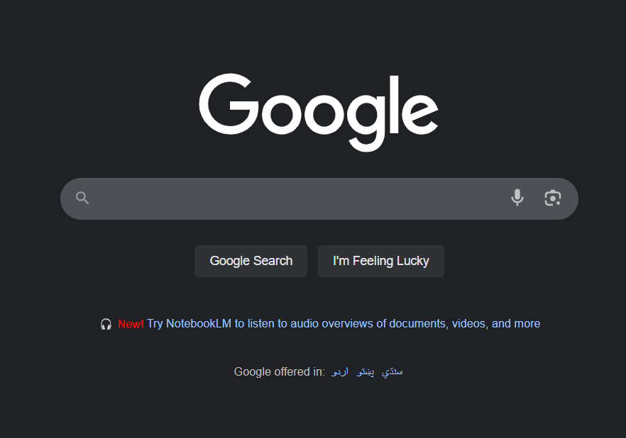
This is the power of colors in UX.
Pro Tip: Words like "New" and "Free" always grab our attention. You’ve probably seen them often in landing pages, lead magnets, and email subject lines.
Want to go deeper? Read more about UX writing and microcopy.
Why colors and fonts work so well
Our brains are wired to notice things that stand out. When everything looks the same, we get bored and stop paying attention. But when something pops, like a bright red button or bold text, our eyes can't help but look.
Think about traffic lights. Why do we use red for stop? Because red naturally grabs attention and signals danger or importance. The same principle works in design.
The Science Behind Attention
When you scroll through a website, your brain processes information in milliseconds. It decides in less than a second what deserves your attention.
Colors and fonts are like signals shouting, "Hey, look at me!"
- Bright colors create contrast.
- Bold fonts create hierarchy.
Together, they guide your eyes exactly where the designer wants them to go.
Choose Fonts and Colors Wisely
Whenever you design something, whether it’s a website, app, or landing page; always think about text fonts and colors.
They do more than just look pretty. They guide your users. They draw attention to what matters most.
Let’s look at another example, this one is from the StarterStory landing page:

You’ll notice the green underline highlights specific words, and that visual cue pulls your eyes in.
If you have just launched your SaaS and want to have some early users without relying on ads, read about how to market new SaaS without spending $1000s.
Fonts Can Speak Too
Colors aren’t the only attention-grabbing element.
Fonts play a major role in setting the tone and grabbing interest.
Just look at this screenshot from DesignJoy:
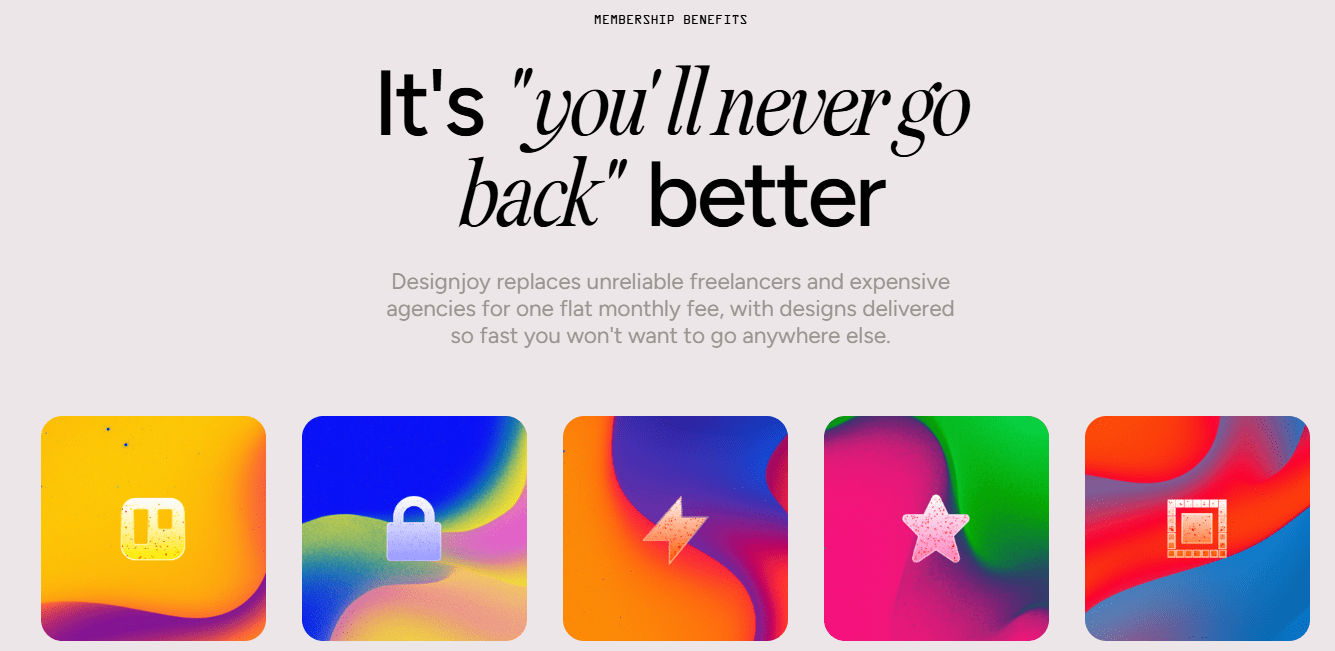
That italic and unique font style instantly tells you this brand is different, and you end up reading the whole line simply because of that visual distinction.
So next time you’re designing or building a UI, always keep fonts and colors in mind.
Pro Tip: Many designers think more colors mean more attention. Wrong. Too many bright colors actually hurt your design. Your users get confused about what's important. The same goes for fonts. Using 5 different fonts doesn't make your design better. It makes it messy and hard to read.
How to Use Colors to Get Attention
Use the 60-30-10 rule:
- 60% neutral colors
- 30% secondary colors
- 10% accent colors for key actions or highlights
Make buttons stand out:
Use bold, bright colors like red, orange, or green for call-to-action buttons.
Build emotional connections with color:
- Blue builds trust (used by companies like Facebook and PayPal)
- Green suggests growth and freshness (think of Mint or Evernote)
- Red creates urgency (often used in food and entertainment, e.g., YouTube, Netflix)
Test contrast:
Make sure your text is always readable against the background. Use tools to check accessibility standards.
Real-World Examples:
- Netflix uses red for their main buttons because red creates urgency and excitement.
- Spotify uses bright green to make their premium upgrade button impossible to miss.
- Apple uses simple, clean fonts that feel premium and trustworthy.
Remember :Good design isn't about looking fancy.
It's about making the right things easy to notice and the important things impossible to ignore.